Unveiling Anaplan’s new identity: Bold, sophisticated, and designed for what’s next


Our brand has now evolved to reflect Anaplan’s position as the only AI-infused scenario planning and analysis platform to optimize decision-making.
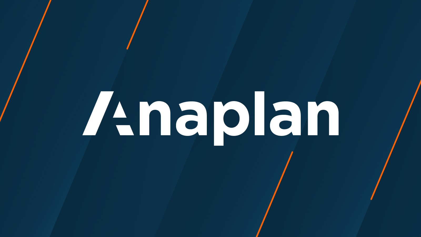
A rebrand is more than a new look — it’s a reflection of who we are and where we’re going. At Anaplan, we don’t just embrace change, we drive it. For years, we’ve helped our customers win, to navigate complexity and outpace their competition, and the market. Now, our brand is evolving to reflect that same bold vision. This is more than a refresh — it’s a powerful expression of our identity and unwavering commitment to our customers. We’ve created a dynamic, future-forward brand that not only represents who we are today, but more importantly the innovation we’re building for tomorrow.
The art of color: Sophisticated, approachable, and unmistakably us
Our updated color palette is a bold reflection of who Anaplan is, striking the perfect balance between expertise, adaptability, and innovation. Designed to be both dynamic and versatile, it highlights our platform’s power, while capturing the bold thinking of our customers. Deep ink hues exude confidence, while vibrant orange accents infuse energy and dynamism. As a fundamental element of brand expression, color shapes how we are perceived and experienced, ensuring we remain both aspirational and approachable. This carefully curated selection creates a visual identity that is as powerful, sophisticated, and forward-thinking as our solutions — bringing clarity, engagement, and impact to every touchpoint.

Elevating the “A”
At the heart of our new identity is our signature “A.” More than just a letter, it’s a defining element that represents the strength, agility, and momentum of Anaplan. We’ve extended its angles into key graphic elements throughout our brand system, influencing everything from iconography to motion design. This evolution ensures the “A” stands confidently on its own — not just as a letter, but as a powerful symbol of our brand’s leadership. Subtle yet impactful, this refined design creates a seamless visual language that reinforces brand consistency while allowing for dynamic creative expression.

The words behind our brand
Beyond design, our brand is built on three core statements that individually reflect our dedication to customer success — but together, embody our relentless commitment to shaping the world’s next game-changing, visionary organizations.
"When you have to make the right decisions — right now" isn’t just a tagline — it’s a necessity in today’s fast-moving business landscape. In a world where speed and precision define success, Anaplan delivers real-time, actionable insights that empower customers to optimize their decisions.
"Outpredict. Outplan. Outperform." is more than a statement — it’s a promise. As the only AI-infused scenario planning and analysis platform that connects and activates data across the enterprise, Anaplan gives customers a decisive edge. With precise, predictive, and generative insights, businesses can anticipate change, optimize strategies, and stay ahead of the competition.
"Be the next." is not just an invitation — it’s a challenge. Whether becoming the next innovator, trendsetter, industry leader, or category disrupter, this tagline reflects the opportunities our platform unlocks for our customers. With Anaplan, organizations can break barriers, set new standards, and move boldly into the future with confidence.

Bringing our platform to life
This year, we’re extending our brand into the product UX/UI to deliver a more modern, streamlined, and content-focused experience across our platform. Our applications are being refined for greater consistency and usability across our portfolio of solutions for supply chain, sales and marketing, finance, and workforce. We’re also introducing a refreshed look and feel, with updated login pages that reflect our new brand identity, a refined global navigation and homepage that puts your content front and center. Beyond the platform, we’re bringing our brand to life by incorporating more platform imagery across our website and other assets through updated photography and animations.

The next chapter
Brands evolve, and this refresh is a bold step forward in Anaplan’s journey. More than a new look, it’s a renewed commitment to innovation and growth, but most importantly, for our customers. As we push boundaries and shape the future, we invite you to explore this new Anaplan — designed for what’s next.
